Access time can slow down disk operations because it adds an extra write every time a file is accessed. This is most noticeable during boot when many files are read, and the access time located on another part of the disk is recorded. To turn off atime, just follow these steps
Windows: simply run “FSUTIL behavior set disablelastaccess 1” at the command line.
Linux: a few more steps are required, since the atime property is set per partition.
- vim /etc/fstab
- change defaults under mount options column to noatime
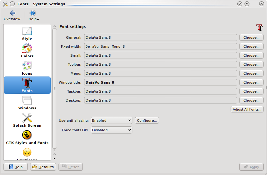
Besides editing the font configuration file, there is an easier way to adjust font settings on desktops like GNOME and KDE. This article will cover KDE, since I just read another article that tries to make Ubuntu look like Mac OS X.
- Menu > Computer > System Settings
- Under Look & Feel, Appearance
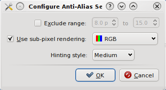
- Click Fonts > Configure
- Make sure sub-pixel rendering is enabled if you have an LCD screen and Hinting style is set to the preferred level. Hinting affects the edge contrast of fonts.
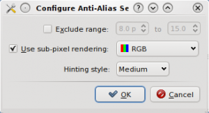
- Click Ok and Apply
After doing a font rendering comparison on Linux and Windows, I thought there was more that can be done in Linux. The script I wrote to display fonts at different pixel sizes helped to pin down the places where I noticed display artifacts. I notice font problems most often when browsing the web. A site like LifeHacker uses a font that’s not installed my Linux box. At other times, random colors appear on the edges of fonts at certain pixel sizes. However, the following font configuration file will make font on every page appear smooth if Firefox is configured to use system fonts. More on that in a later post.
/etc/fonts/local.conf
[cc lang=”xml”]
true
medium
false
rgb
true
hintmedium
true
9
hintfull
13
hintslight
false
[/cc]
After editing the file, a restart of your application is required for the settings to take effect (for me it was Firefox, since I was testing font configuration).
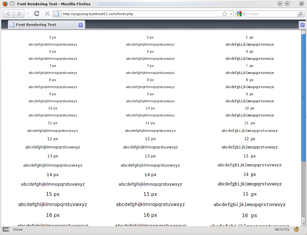
After changing some font display settings in Linux, I wanted to test the changes. The specific change I wanted to test was the hinting level adjusted by pixel size. Hinting affects how sharp the edges of displayed fonts are. (Note that this is different from print appearance.) The article that got me started adjusting font display is a post on Planet Gentoo that I read a while ago. I noticed that there was a suggestion to use medium hinting to reduce fuzziness on small fonts. That was interesting, so I turned on full hinting for small fonts, hint medium for medium fonts, and hint slight for large fonts. You can see the result on the screenshot.
Linux
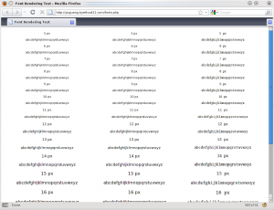
Medium hinting is set for pixel sizes between 7 and 11. As the size becomes larger, there are noticeable color fringes on the edge of the fonts. That’s where hint slight comes in.
Now, there’s nothing fancy going on in Linux as all the settings can be changed in an XML file. So after adjust font in Linux, I decided to write a webpage to test the different pixel sizes.
[cc lang=”php”]
Font Rendering Test
\n”;
for($i=5;$i<22;$i++){
echo "
” . $i . ” px
\n”;
echo “
” . $s . “
\n”;
}
echo “
\n”;
$n++;
}
?>