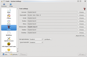
Besides editing the font configuration file, there is an easier way to adjust font settings on desktops like GNOME and KDE. This article will cover KDE, since I just read another article that tries to make Ubuntu look like Mac OS X.
- Menu > Computer > System Settings
- Under Look & Feel, Appearance
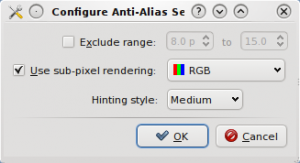
- Click Fonts > Configure

- Make sure sub-pixel rendering is enabled if you have an LCD screen and Hinting style is set to the preferred level. Hinting affects the edge contrast of fonts.

- Click Ok and Apply
After doing a font rendering comparison on Linux and Windows, I thought there was more that can be done in Linux. The script I wrote to display fonts at different pixel sizes helped to pin down the places where I noticed display artifacts. I notice font problems most often when browsing the web. A site like LifeHacker uses a font that’s not installed my Linux box. At other times, random colors appear on the edges of fonts at certain pixel sizes. However, the following font configuration file will make font on every page appear smooth if Firefox is configured to use system fonts. More on that in a later post.
/etc/fonts/local.conf
<?xml version="1.0"?>
<!DOCTYPE fontconfig SYSTEM "fonts.dtd">
<!-- /etc/fonts/local.conf file to configure system font access -->
<fontconfig>
<!-- Use the Autohinter -->
<match target="pattern" >
<edit mode="assign" name="autohint" >
<bool>true</bool>
</edit>
</match>
<!-- Disable Autohinting for bold fonts -->
<match target="font">
<test name="weight" compare="more"><const>medium</const></test>
<edit name="autohint" mode="assign"><bool>false</bool></edit>
</match>
<!-- Enable sub-pixel rendering -->
<!-- Uncomment this if you have an LCD screen -->
<match target="font">
<edit name="rgba" mode="assign"><const>rgb</const></edit>
</match>
<!-- Font hinting to increase edge contrast -->
<match target="font">
<edit name="hinting" mode="assign"><bool>true</bool></edit>
<edit name="hintstyle" mode="assign"><const>hintmedium</const></edit>
</match>
<match target="font" >
<edit mode="assign" name="antialias" >
<bool>true</bool>
</edit>
</match>
<!-- Exclude/Include a range of fonts for Anti Aliasing
<match target="font">
<test qual="any" name="size" compare="more"><double>8</double></test>
<test qual="any" name="size" compare="less"><double>18</double></test>
<edit name="antialias" mode="assign"><bool>true</bool></edit>
</match>
-->
<!-- And/Or disable Anti Aliasing for a range on pixel-based size.
Disabling this using both methods seems to fix Firefox.
<match target="font">
<test compare="less" name="pixelsize" qual="any"><double>20</double></test>
<edit mode="assign" name="antialias"><bool>false</bool></edit>
</match>
-->
<!-- Strong hinting for small fonts, increases sharpness.
Enabling this seems to fix Firefox.-->
<match target="font">
<test compare="less" name="pixelsize" qual="any"><double>9</double></test>
<edit mode="assign" name="hintstyle"><const>hintfull</const></edit>
</match>
<!-- Light hinting for large fonts, reduces sharpness.
Enabling this seems to fix Firefox.-->
<match target="font">
<test compare="more" name="pixelsize" qual="any"><double>13</double></test>
<edit mode="assign" name="hintstyle"><const>hintslight</const></edit>
</match>
<!-- Ignore any embedded bitmaps in TTF, etc (Microsoft's Calibri and others from Office 07/Vista have these) -->
<match target="font" >
<edit name="embeddedbitmap" mode="assign" >
<bool>false</bool>
</edit>
</match>
</fontconfig>
After editing the file, a restart of your application is required for the settings to take effect (for me it was Firefox, since I was testing font configuration).
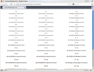
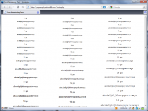
After changing some font display settings in Linux, I wanted to test the changes. The specific change I wanted to test was the hinting level adjusted by pixel size. Hinting affects how sharp the edges of displayed fonts are. (Note that this is different from print appearance.) The article that got me started adjusting font display is a post on Planet Gentoo that I read a while ago. I noticed that there was a suggestion to use medium hinting to reduce fuzziness on small fonts. That was interesting, so I turned on full hinting for small fonts, hint medium for medium fonts, and hint slight for large fonts. You can see the result on the screenshot.
Linux

Medium hinting is set for pixel sizes between 7 and 11. As the size becomes larger, there are noticeable color fringes on the edge of the fonts. That’s where hint slight comes in.
Now, there’s nothing fancy going on in Linux as all the settings can be changed in an XML file. So after adjust font in Linux, I decided to write a webpage to test the different pixel sizes.
<html>
<head>
<title>Font Rendering Test</title>
<style type = "text/css">
.col1 {
float:left;
width:33%;
margin-left:1px;
}
.col2 {
float:left;
width:33%;
margin-left:1px;
}
.col3 {
float:right;
width:33%;
margin-right:1px;
}
</style>
</head>
<body>
<center>
<?php
$s = "";
for($i=97;$i<123;$i++){
$s = $s . chr($i);
}
$font_families = array("Serif", "Sans-serif", "Monospace");
$n = 1;
foreach ($font_families as $font){
echo "<div class="col
" . $n . ""style="font
-family
:" . $font . "">\n";
for($i=5;$i<22;$i++){
echo "<p style="font
-size
:" . $i . "px
">" . $i . " px</p>\n";
echo "<p style="font
-size
:" . $i . "px
">" . $s . "</p>\n";
}
echo "</div>\n";
$n++;
}
?>
</center>
</html>
</body>
</html>
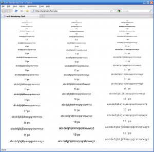
I happened to be using a computer running XP while I wrote this, so I decided to run the test on that computer, too.
XP

XP, like Linux, does have color fringes, but they are less noticeable and appear at all font sizes.
Today, I booted Windows 7 to fill out a PDF form and print it across the network. I also planned to do some PDF editing using PDF X-Change Viewer. One thing that makes Windows different from Linux is that applications don’t have system-wide configuration file. PDF viewers have their own font rendering settings. Anyways, here’s what the fonts look like in Windows 7:
7

Fonts in 7 does not have any rendering artifacts. Which is a reason people do notice the difference when they switch to another OS.
