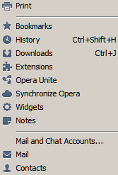
Opera 11.5 Minimalist Icons
Minimalist design enables users to accomplish their tasks faster. The new version of Opera gets out of my way with non-distracting icons.
In Opera 11.5, the status icons are all the same color, allowing attention to be drawn to other areas of the browsing experience. Having one icon red, the other green uses the traffic light analogy, while these areas and the colors used as signals don’t require user action. So in this version, the Opera Unite red, which is Opera’s favorite color for branding, was dropped to opt for light blue for all icons.
